

(Above: Image taken from the previous shoot)
Therefore, we ventured into London where I took some new images........
Editing
The images were retouched and the levels and brightness were adjusted.

Here you can see the contrast in colour
This image was chosen to be the front cover and was manipulated in several ways. Firstly, the image was given a comic book/pop art looking using special effects on photoshop; including the use of poster edges. This correlates with the visuals that were shown in the music video.
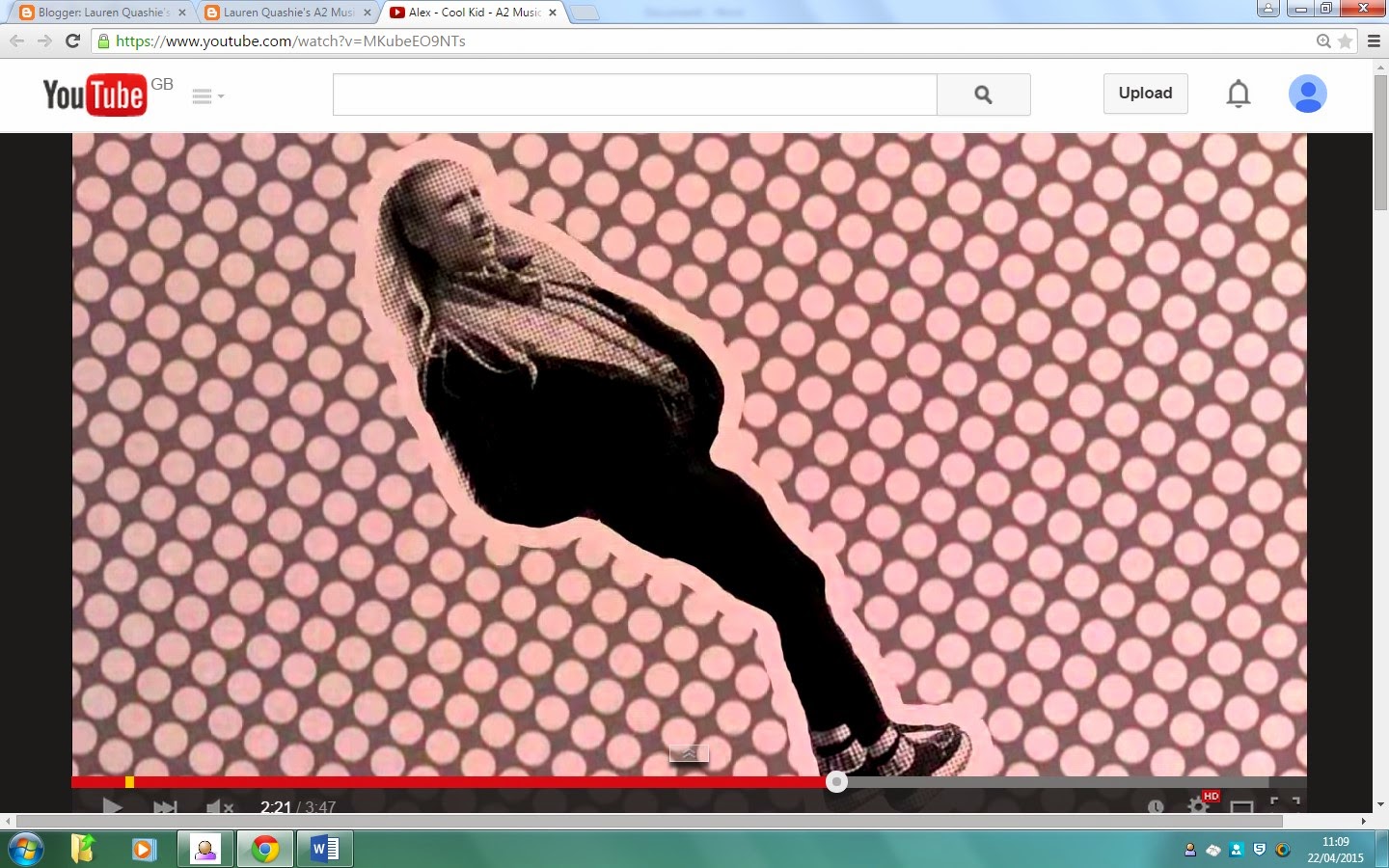
Screen shot from the mv

The album cover
As well as that the album needed a tracklist. So I took the following image, cropped it and added text in the font and colour that matched the front cover.


The back (tracklist)
Below are the rest of the images that were chosen to be a part of
the digipak.


Through photoshop the images were inserted into a digipak template. In this way we are able to see what the real image would look like.


No comments:
Post a Comment