
Saturday, 25 April 2015
Friday, 24 April 2015
Wednesday, 22 April 2015
Creating the Digipak
Although the first set of images that I took came out well, we as a group agreed that the pictures did not fit the concept well enough; as we wanted to create a young, vibrant and trendy brand identity for our artist.


Therefore, we ventured into London where I took some new images........


(Above: Image taken from the previous shoot)
Therefore, we ventured into London where I took some new images........
Editing
The images were retouched and the levels and brightness were adjusted.

Here you can see the contrast in colour
This image was chosen to be the front cover and was manipulated in several ways. Firstly, the image was given a comic book/pop art looking using special effects on photoshop; including the use of poster edges. This correlates with the visuals that were shown in the music video.
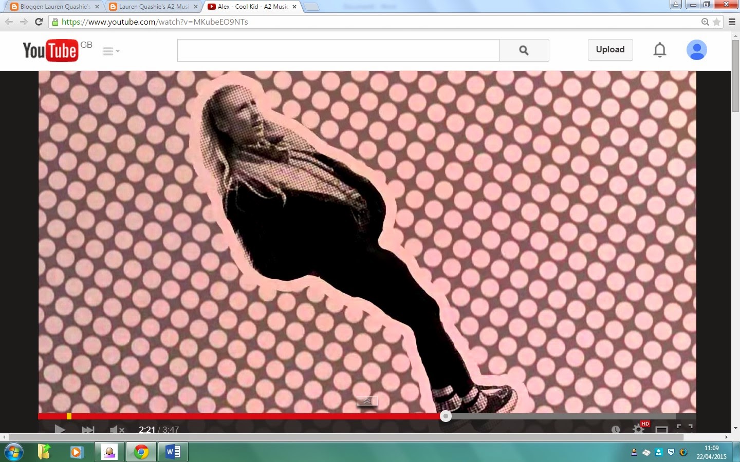
Screen shot from the mv
The album cover
As well as that the album needed a tracklist. So I took the following image, cropped it and added text in the font and colour that matched the front cover.


The back (tracklist)
Below are the rest of the images that were chosen to be a part of
the digipak.
Through photoshop the images were inserted into a digipak template. In this way we are able to see what the real image would look like.

Creating the Advert

For our advert we wanted the image to be fun and vibrant so it would stand out.
We decided on this picture as it was bright and left enough space to advertise the artist.
Here is the advertisement that Georgia did which came out very well.

However, after reviewing the final product we felt that there was too much space and that the image was too plain.
We then decided to change the image and add some sort of effect to liven up the image.

We decided that adding a cartoon/comic book/pop effect would give the image the extra visual appeal it needed and would also tie in with the music video very well.
 Screen shot from mv
This is the first attempt that Georgia and I put together. As you can see the text is bright and bubbly.

This is the final result

However, we felt that this was not quite the effect that we wanted as it washed her out and made her look plain; therefore we decided to try another approach.
We found another tutorial and came up with a more pop art look.

Once we had decided that we loved this look we went through a process of choosing what the artist's brand identity would look like. We then proceeded to play with different looks, fonts and shapes.


Lastly, we added reviews and music sites in which the consumer could purchase the artist's music.
Thanks to Georgia's meticulousness this took us quite a while, but in the end it was worth it as it turned out very nicely. I think the advert works because it is eye catching and will lead the consumers to be curious about the artist; therefore looking them up which is the main goal of an advert.

The finished Advert
Tuesday, 21 April 2015
Music Video Feedback
Subscribe to:
Posts (Atom)